Monday, 17 October 2011

Digital Tools - Monster Assignment


Step 1: Concept

Step 2: Lines

Step 3: Colours

Step 4: Beginning Tones

Step 5: Midway Tones
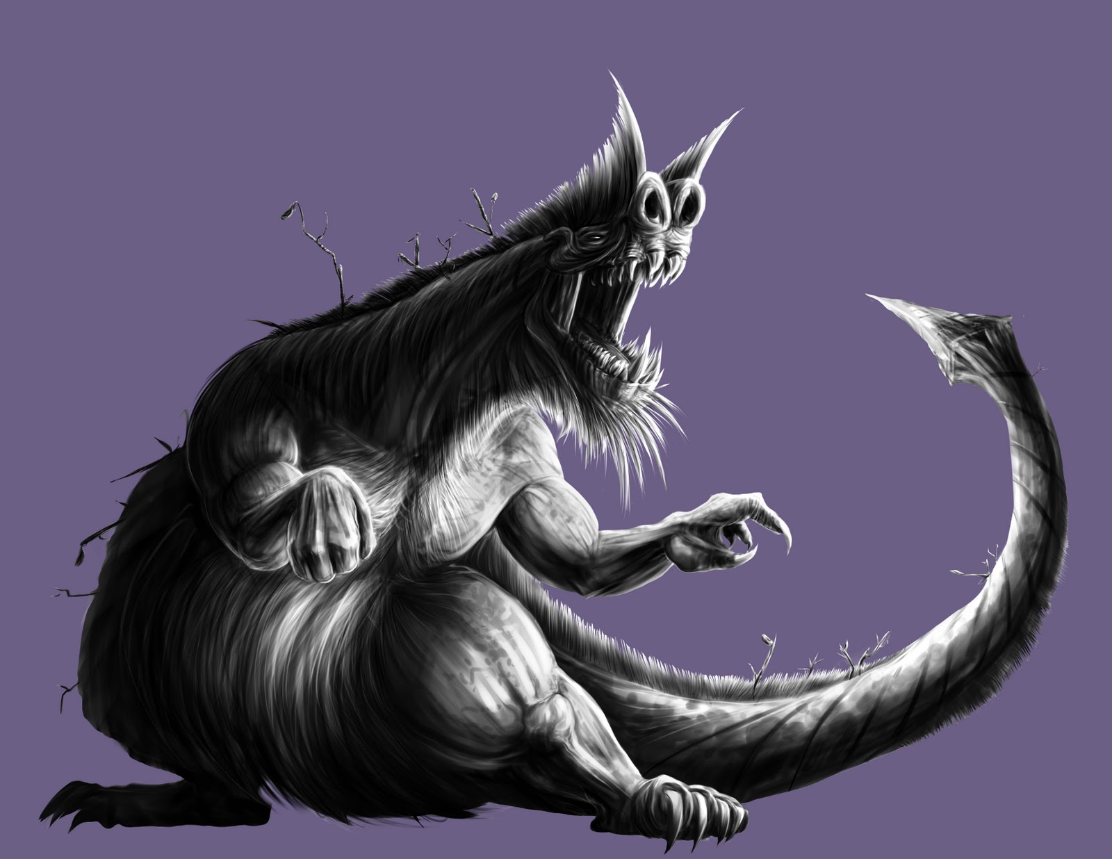
Step 6: Final Tonal

Step 7: Colour Experimentation


Step 8: Final

It is known as a Filth Beast (the Beast for short), which prefer to inhabit moist and damp environments. It is a notorious predator, and complimented with it large size (up to 45 feet long and weighing up to 60,000 pounds) it is a deadly threat. Another notable trait of a Filth Beast is it's nauseating smell. A person can easily tell if a Beast is nearby, generally by the fact they start vomiting when the rank stench enters their nostrils. 

The Beast has been known to wander into the sewage systems of larger cities however, where it consists on a diet of waste and filth until it is discovered. Considered one of the most dangerous omnivores on the planet, it eats with little regard for living, dead, organic and inorganic meals.

Mating season for a Beast is the worst time to meet one. A male Beast tries to gather as many corpses as possible and gift it to the considerably larger female Beasts. These mating rituals generally involve the deaths of livestock, animals and quite often people.

________________________________________________________

In terms of the painting, however, I tried a different approach. I began with literally drawing the skeleton (based off that of a Giant Ground Sloth), and then built the muscles on that structure. I also considered making the colour scheme based on that of a swamp one, as per the backstory of the Beast. In the end, the rendering of the Beast was paramount, and I made sure the tones were solid before bringing it into colour.

Once again, there was a lot of difficulty in combining the grayscale render with the colours. I used multiple clipping masks with overlays in order to get the desired effects.

After much experimenting, I ended with the final piece.

Tuesday, 4 October 2011

Head and Hands Painting Assignment

For this assignment I chose to paint the character I created for Character Design class named Bloodfeather. I tried to encompass her emotion on the battlefield, which is bloodlust. I initially wanted to draw a much more contorted expression similar to that of the Maori Warriors, who stick out their tongue and while performing war dances. I quickly realized this looked incredibly stupid, so I intentionally made the look with more allure rather than a psychotic one. I then tweaked the anatomy and slightly changing the character design, I used the drawing program Sai to create the lines. I ended up doing the greyscale tones in Sai as well, before jumping into Photoshop to place the colour flats. After that, I created the skin tones using a multiplied layer and overlay, playing with the possible tones. I decided to use a light blue background as that would complement the earthy-toned character. After placing some wrapping blue shadow and gradient, I finished off my painting of Bloodfeather.


Wednesday, 21 September 2011

Digital Tools - Room Assignment


Step 1.


Step. 2


Final.

This assignment I felt I was definitely pushed out of my comfort-zone, as I generally lean more toward character-based paintings. This is usually because I feel I have a bit of difficulty with more technical aspects of painting, so I'm glad I had this time to practice one of my weaknesses. The parts of the painting that I felt the most difficult were in the shadow cast by the chair as well as the reflection in the window. These areas, I believe, could have the benefit of a bit more refinement. The strengths of it I see are in the cast shadows, particularly the drapes and chair. I chose the lamp light source behind the couch as I felt it could cast the most interesting shadows composition-wise, which I think helped highlight everything. It also aids in guiding the eye toward a possible character sitting in the couch. If there is anything I would change about this painting, it would be to add more texture to the wood panels, which I think would make it more believable. 

In the end, I felt I gained more confidence in painting layouts with this assignment.

Wednesday, 14 September 2011

Digital Tools - Fish Assignment

Step 1

Step 2

Step 3

Final

First Try


This is the cute little fishy I made for Zub's Digital Tools class.  This fish character I pictured being tropical and ornate, like a Lionfish. This is actually my second attempt at painting the fish, as my first try I struggled with the scales and the atmosphere of underwater. This time around I feel had much more refinement, as well as a generally more 3D feel. Painting was never my strongest suit, but I definitely feel this shows an improvement over my work from last semester. I experimented with more brushes throughout, particularly with the fins and scales. In the future I hope to expand upon the fish in colour, and possibly a more ornate background as well.

- David

Friday, 1 July 2011

Ganondorf Redesign

Hey hey!

Finally I snipped off my Ganondorf from a while back... I tried a more bestial approach this time around. Overall I'm satisfied with the end product, and here's a little of the process of me getting there!


That's all folks!

- Dave

Saturday, 11 June 2011

Generic Drawing Dump

Hey hey!

Long time no post. Here's a shizload of work I've done since the start of this semester, hope y'all enjoy!


Monday, 9 May 2011

Just a Buncha Café Sketches...

Hey hey!

Here's a buncha café sketches I did over the break as a warm up for second semester animation... I tried aiming more for the expression of the people rather than the likeness.

Hope y'all like em'!

- Dave